
From Form Studies to Data Charts: The Shared DNA of Making Things Clear
how Pratt's industrial design curriculum created the perfect training for the information age

Beyond the visual end result, what is the process of making a good data visualization graphic? Does one get the data, put it in a bar or line chart then say tada I have completed your request where you listed 20 filters and 8 subcategories to look at 1-3 metrics. If that is your process and your wondering why you usage drops down to zero after a week in production then I have some tips for you.
But first lets start with the birth and history of Industrial Design (ID). Back in 2022 a compilation of articles was put in book form, Alexander Kostellow Collected Thoughts assembled by Bruce Hannah and Tucker Viemeister. I of course jumped right on to purchasing the book, since I never really knew about the history of ID. Originally accepted (early application even) to Pratt Institute as a painting major, it was only after completing the first year that I was drawn into the three dimensional space.

Alexander is thought to be a primary influencer in the curriculum of the first foundation year and ID courses taught at Pratt. I went through the foundation year, the curriculum remains the same for 80+ years even though it was first put together in the late 1930s. This overlaps with the mid-century design period discussed in my first post. Design methods taught include “design thinking and strategy, ethnography, ergonomics, interaction design, and multi-disciplinary project-based collaboration.”
“The industrial design curriculum prepared its graduates to understand the material requirements of mass production, to anticipate the desires of consumers, and to employ the logic of aesthetic structure.” from Mnemonics to Technology of Gestalt: Teaching the Late Modern Artist, 1989
Now lets compare the ID process to create mass produced products to data visualization translation of data to reveal relationships and patterns.
Start with a study
In the ID curriculum there is study of the basics of geometric forms, how they interact spatially. Breaking objects down into cubes, spheres, cylinders, planes. Then understanding how materials are processed and manufactured. What the key characteristics of each material (metals, woods, glass, clay, plastics) “such as strength, weight, color, finish texture, and finishes that can be applied, workability and cost.” (from Modern Plastics article re-printed by Pratt Institute) In the data viz world that is understanding the grammar of graphics framework created by Leland Wilkinson published in his book in 1999, based on ggplot2 package for R. But today we have more than programing tools from BI tools like Tableau + Looker, design tools like Adobe Illustrator + Figma, and web based collaborative platforms like chart.js + observable. Understand the capabilities, strengths, limits of each of these tools is something to evaluate. Also knowing the cost, effort, skillset needed to create in the different tools is a useful initial step to ensure the right tool (material) is selected.
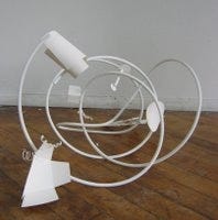
Three dimensional thinking
ID’s basis is modeling and prototyping with clay to get a three dimensional view of the product. This can start with sketching with perspective in mind then moving on to clay (I still have the oil based clay, can’t get the smell of it out of my head & I will forever be in love with the many states of plaster, marshmallow consistency being the funniest). This thought process encompasses abstract design, visual literacy, and structure of visual relationship.
“The artists medium is space. Space maybe regarded as composed of two elements: 1, occupied that is positive (form) and 2, unoccupied or negative space (volume).” Alexander Kostellow in a letter to Ross Moffett Oct 12, 1930
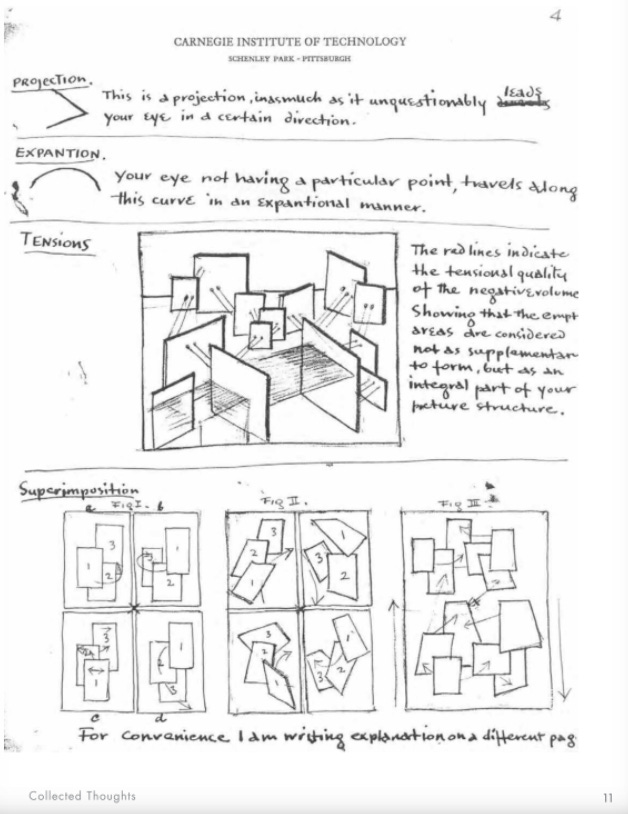
Space in data viz is typically two dimensional but with data art and three dimensional modeling on the rise we are seeing more charts that allow the user to shift the perspective. That might be from making it more personal, selecting a location they live via a filter or walking around the data art sculpture. Then there is the abstraction of data presentation, from its rawist form into a bar or line chart or encoding visuals to give more context or meaning.
Collaboration
Industrial designers worked with engineers, manufacturing partners, supply chain, marketing teams, product management, finance teams. They excelled at being a generalist with the key identity of a designer.
In my experience, the best projects I have worked on include people from many areas. Whether it is the data engineer or architect to multiple identities of the business from high level management to front end operations. The more types or people that are included in the process then better the outcome and use of the end product.
Ideation
Once a designer is on a project, understands the objective, then its time to create as many ideas as possible, good or bad, all about quantity not quality. In this early stage its not about creating the perfect end result or going with the first thing that comes to mind. Instead approaching the problem from multiple points of view, brining in that three dimensional thinking.
When thinking about visually displaying data you can start either from exploring the data uncovering an insight or pattern to display or how you want to visually display the data. Either starting point requires considering both aspects.
Iterate, iterate, iterate
Then thats where iteration comes into play. Once you narrowed down to one or two concepts, creating the initial prototype, keep on fine tuning the design. Depending of the projects importance and available time there may only be three iteration cycles or twenty. In this stage it is all about editing, bringing in collaborators to get feedback and problem solved together, remove parts or adding more context or details to make the patterns more visible. And even if you do ship a product, there are times when you need to add on 3, 6, or 9 months later, then the whole process starts again.
Few other things to note specific to data visualization
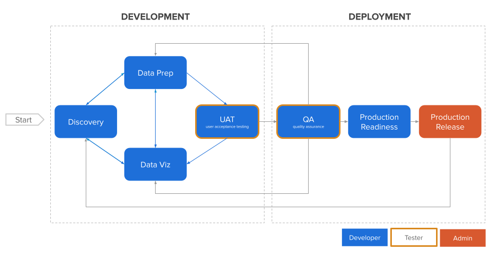
On the other hand, the software development life cycle (SDLC) has been established from development to deployment cycles (IBM ASUM-DM → Analytics Solutions Unified Method for Data Mining). There are aspects of what was stated above embedded in that process. But instead of systematically approaching things, fixing bugs or user requests. Can we have a design thinking first approach instead, not hyper focused on one small aspect, but zooming out and thinking of the big picture and long term effects.
Finally, performance is key when building a data visualization, which comes back to understanding the materials. If you create a user friendly beautiful interactive graphic but it takes 45 seconds to load, then you missed something in the iteration process. Set standards for performance to align with user expectations.
Wrapping up
In the data visualization field, people start their careers from various places from academic, journalist, to information technology. My foundation was the three years of studying industrial design that shaped the way I think about chart creation, not realizing it at first, but as I write these posts I can see the influence more and more.
Now thinking about where you started your data visualization journey
What your are your strengths?
Where you could expand your base knowledge?
How can you improve your process to create charts that users will actually use?
Do you have any take aways or next steps to implement learning about industrial design curriculum?
Because the journey never ends. Keep on learning either becoming more of a generalist or getting deeper in one area. Decide where you want to focus your efforts and how that impacts the products and content you create.
Written by me with AI helping me avoid writers block
Subscribe to learn more about the craft and philosophy behind information design to not only understand how to make an effective chart or graphic but what makes them worthy of the important information they carry.